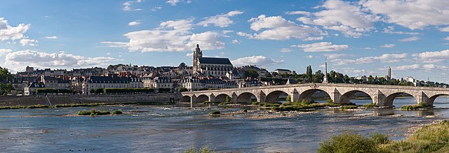
Match Details
Provides three different zoom settings for pop-ups, adapting to various screens. 1 - Overall Fit, 2 - Horizontal Fit, 3 - No Margin, supports animation, close in the top right corner.

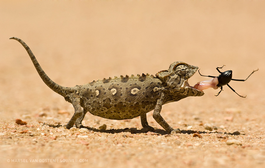
Highlights
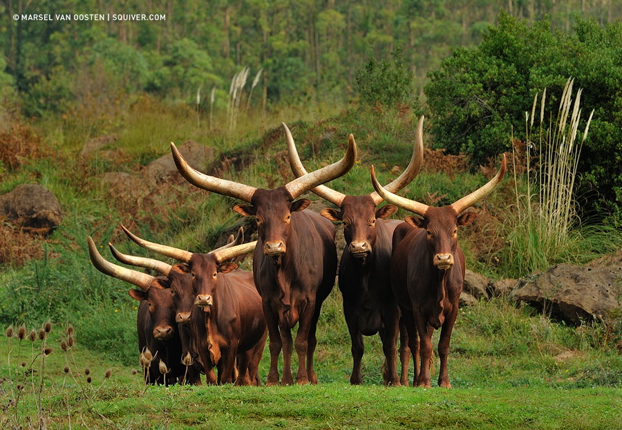
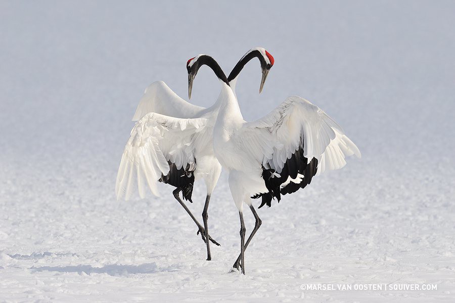
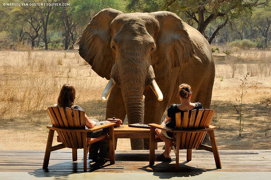
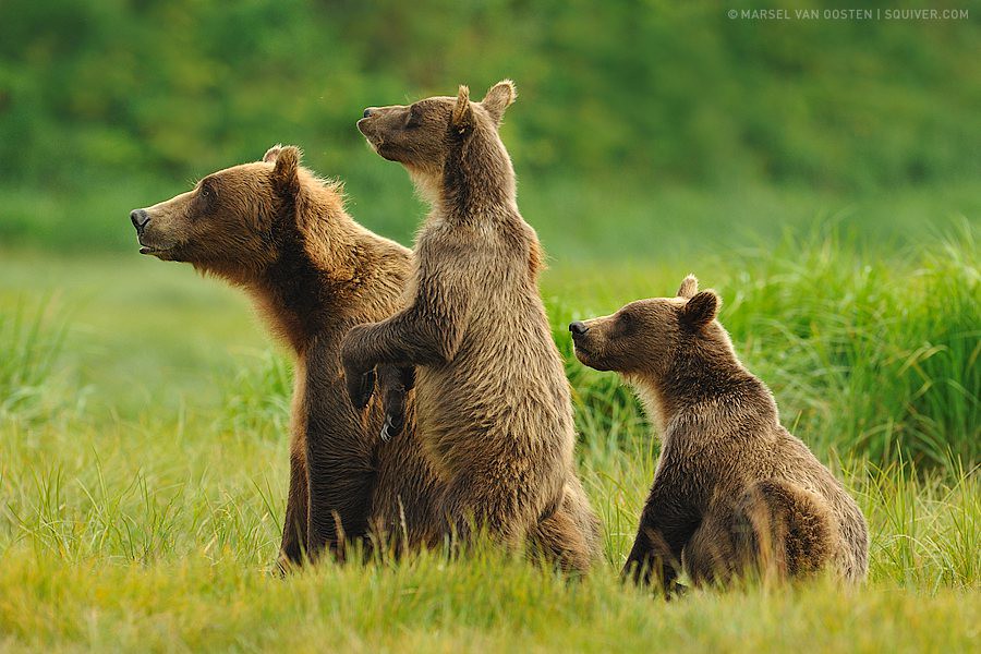
Add rich content to each match, supporting mixed content types. Images can be preloaded based on orientation, optimizing the mobile experience.
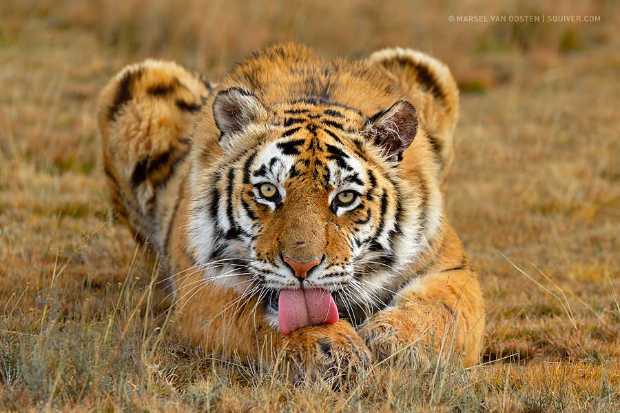



HD Match Replay
Pop-up opens only after the image is loaded, or uses a scaled-down image instead of a thumbnail. Zoom effect only supports images.
Live Video and Map
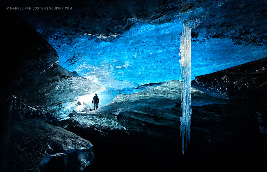
On small screens, the lightbox is automatically disabled, directly triggering the link's default behavior.
Smooth Animation Effects
Animations are achieved through simple CSS transitions, allowing you to freely design the visual effects of the pop-up.
Fade-in Slide Animation
Dialog example
This is dummy copy. It is not meant to be read. It has been placed here solely to demonstrate the look and feel of finished, typeset text. Only for show. He who searches for meaning here will be sorely disappointed.
User Registration
Entered registration information will not be lost, even if you navigate to other pages or return. Ensures user data security.
Instant Content Updates
Full control over pop-up content display, supports CSS alignment, enables or disables scrollbars, achieving personalized layouts.
Important Notice
A modal popup disables the usual ways to close popups.
Modal dialog
You won't be able to dismiss this by usual means (escape or click button), but you can close it programatically based on user choices or actions.
Error Prompt
Basic error message example, both text and style are customizable.